Overview
The Exchange is the marketplace layer of ZZAZZ — where content assets are discovered, compared, and evaluated. It already existed when I joined, but the interaction model had a fundamental problem that was undermining the entire product thesis.
My contribution: Rethink & redesign — moved from a table-first UI to a query-led, AI-native interaction model. This wasn’t a visual refresh. It was a fundamental rethinking of how users interact with priced content.
What Was Broken
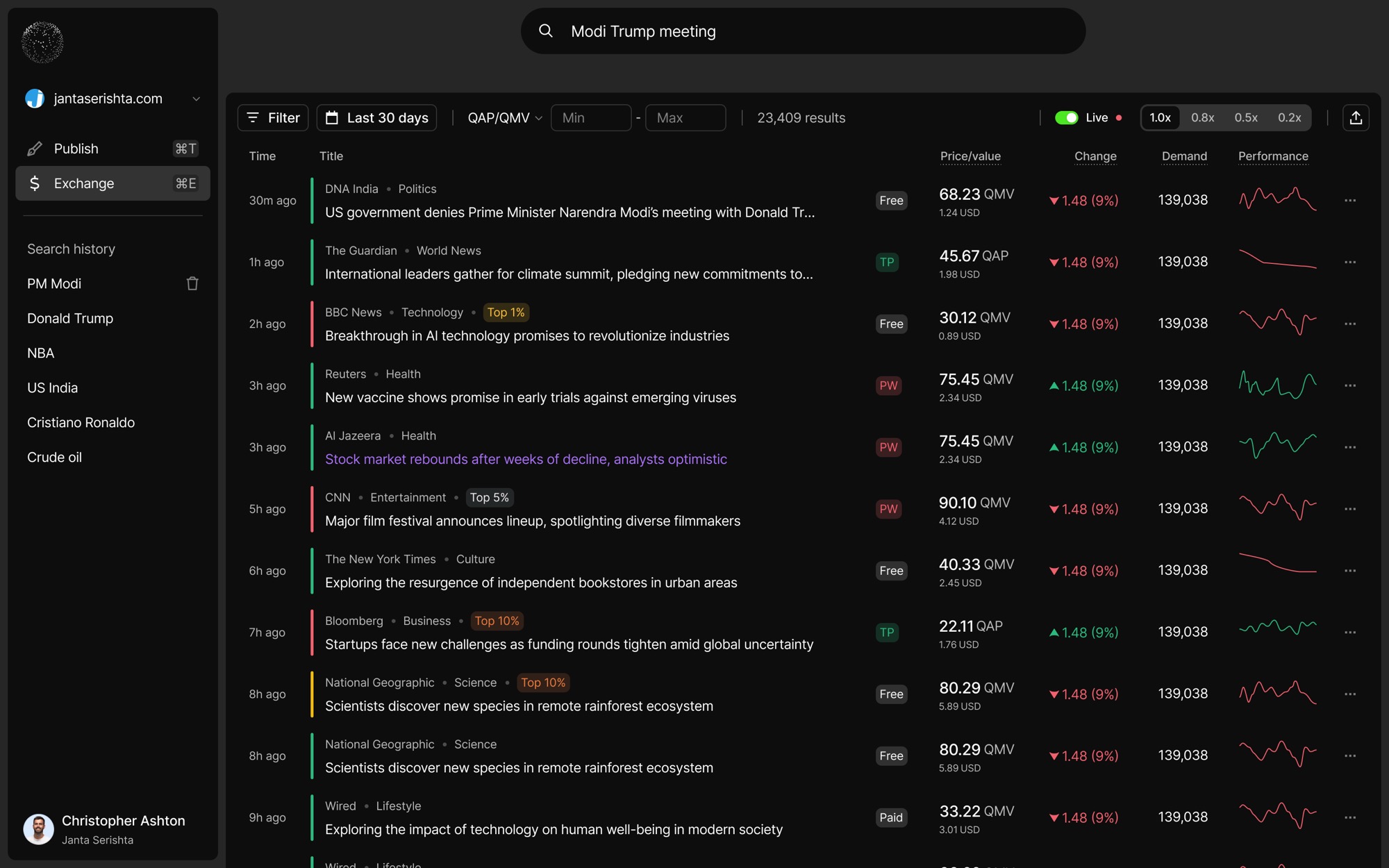
The existing Exchange was built as a live market listing with price movement tables, content performance metrics, and trust factors. The foundation was solid, but the interface assumed users were traders.
Specific failures I identified:
- Users had to learn too many new concepts before they could extract useful insight
- Getting a simple answer required applying multiple filters and knowing the system structure in advance
- Too much data at once — hurting comprehension and slowing decisions
- The UI looked like a financial terminal, but users were content consumers, writers, and researchers — not traders
- Other AI platforms felt easier because users could describe what they wanted in natural language
The Research Trigger
Users think in questions, not in dashboard operations. They want to type “Show me how Modi versus Trump content is performing from top publishers in my region” — not manually reverse-engineer the right filter combination.
This insight came directly from user conversations. Researchers, writers, and editors all expressed the same frustration: they knew what they wanted to know, but the interface made them translate that intent into filter operations. In an AI-first world, users are increasingly impatient with filter flows.
Why This Redesign — Not a Visual Refresh
This wasn’t about making the Exchange look better. The existing UI actively worked against the product thesis. Here’s the core tension I identified:
ZZAZZ’s thesis is that price makes content more accessible. But the Exchange’s table-heavy UI made pricing feel like a barrier — the exact opposite of the thesis. Users saw a wall of numbers and prices before understanding what the content was or why it mattered. The interface was optimized for data density, not for the moment of decision.
The product says “price helps you decide.” The UI says “here’s a spreadsheet.” Those can’t coexist.
I needed to design an interaction model where price enters the experience after relevance — as supporting context, not as the first thing users see.
How I Changed the Direction
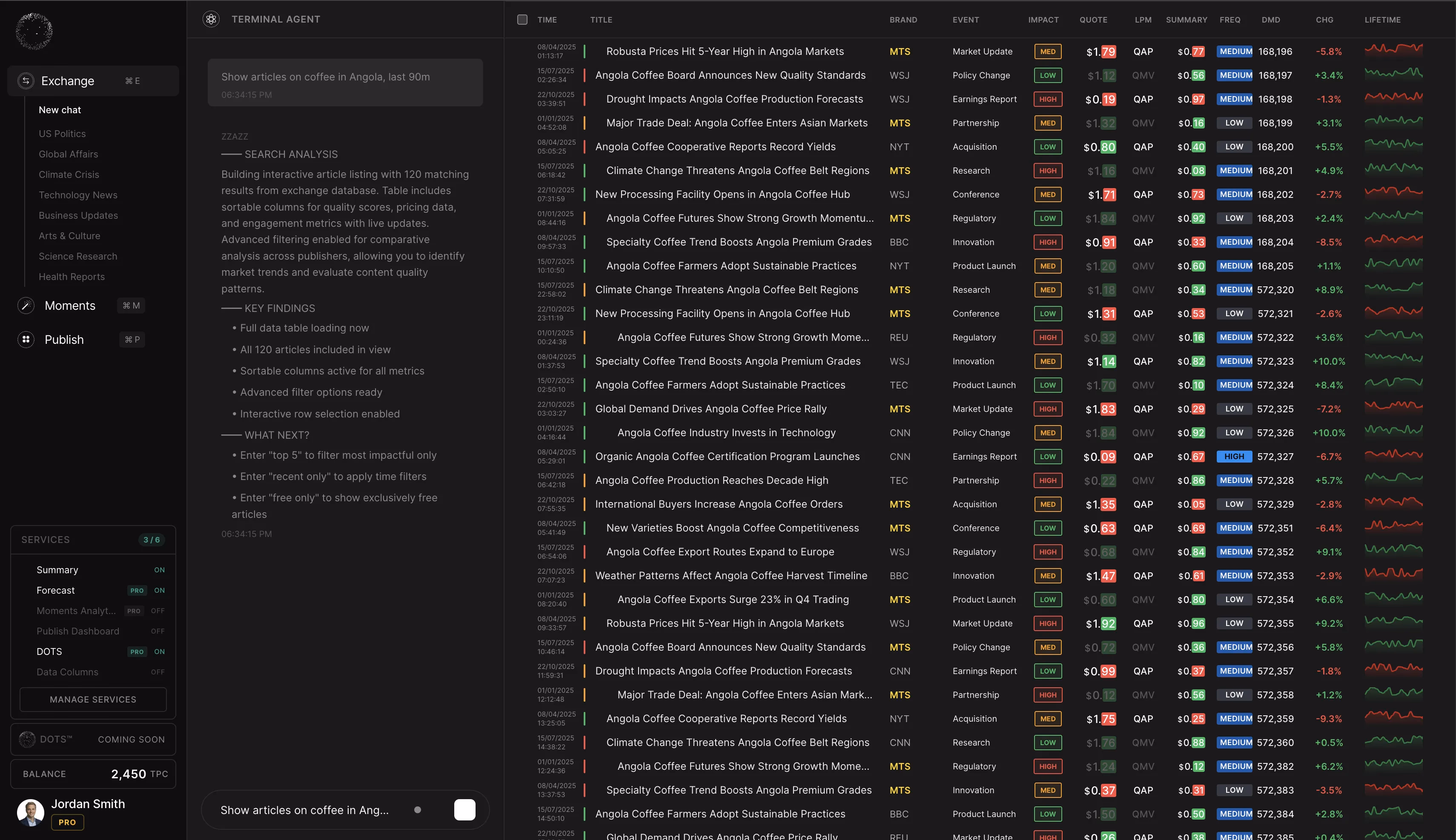
I moved Exchange from a table-led UI to a chat or query-based interface — a fundamental rethinking of the interaction model.
Module vs Hybrid vs Chat — The Trade-Off
I explored three directions and evaluated each against the core user insight (“users think in questions, not dashboards”):
| Approach | Pros | Cons | Verdict |
|---|---|---|---|
| Module — structured dashboard with better filters | Familiar, low risk | Doesn’t solve the core “translate intent to filters” problem | Rejected — polishes the wrong model |
| Pure chat — fully conversational | Solves discovery perfectly | Removes structured views power users need for comparison and deep analysis | Too radical — loses existing power users |
| Hybrid — chat + structured views on demand | Best of both — natural entry, structured depth when needed | Higher engineering complexity, needs clear mode-switching UX | Chosen — solves discovery without sacrificing depth |
Why hybrid won: User research showed two distinct modes — exploration (“What’s trending in climate journalism?”) and evaluation (“Compare these three articles side by side”). A pure approach serves one mode well and the other poorly. The hybrid lets users flow naturally between them.
Core Design Principles — And Why Each Exists
Let the User State Their Need First
Why: In user interviews, every participant could articulate what they wanted in one sentence. But translating that sentence into 3–4 filter selections took 2+ minutes and often produced wrong results. Starting with natural language removes this translation tax entirely.
Show a Curated Subset, Not Everything
Why: The old Exchange showed 50+ rows on load. In testing, users spent the first 30 seconds just orienting themselves — scanning column headers, understanding what each metric meant. By the time they found relevant content, the cognitive overhead had already created friction. Fewer, more relevant results let users actually think about the content.
Tables and Graphs Are Artifacts, Not the Front Door
Why: Structured views are powerful for comparison and analysis — but only after the user has context. Showing a pricing graph before the user understands what the content is creates the wrong frame. Tables appear in response to queries that warrant them, not as the default state.
Price as Context, Not Gate
Why: User research revealed that price works as a positive signal when it appears alongside content quality indicators (“this is well-researched AND priced at ₹45”). But when price appears first — in a column header, before the user reads anything — it triggers loss aversion. The same ₹45 feels like a barrier instead of a signal. Sequencing matters.
The Redesigned Experience
Query State
The user types a natural language question. Suggested queries help new users understand what’s possible — reducing the blank-page anxiety that chat interfaces create. These suggestions are based on trending content, not random examples.
Results View
Curated content cards with pricing signals, trust indicators, and performance context. Each card is designed to answer three questions in under 2 seconds: What is this? Is it credible? Is it worth the price? This is the moment where price enters as context — after the user already understands relevance.
Detail & Comparison View
Drill into any piece of content for full pricing history, performance metrics, and creator context. Compare multiple pieces side by side when evaluating options. This is where the structured data lives — surfaced on demand, not on arrival.
Paid Service Flow
When a query requires a paid service (like summarizing an article), TimePay activates inline — the user pays with cash, credits, or sponsored attention without leaving the conversation. This was critical: any redirect to a separate payment page breaks the discovery flow and drops conversion.
What I’d Reconsider
Suggested queries need real usage data. The initial suggestions were manually curated. In production, these should be generated from actual user behavior — what people search for, what converts, what gets abandoned. Without this, the suggestions risk feeling generic.
The transition from chat to structured view needs more work. Users in informal testing occasionally lost context when switching from conversation to a full comparison table. The mode shift needs a smoother bridge — perhaps a progressive reveal rather than a full view change.
Impact
The conversational direction resonated strongest with investors and users alike. The Exchange went from feeling like a trading terminal to feeling like an intelligent research assistant that happens to understand content pricing.