Don't make users learn. Meet them where they already are.
I joined Zzazz as a Product Designer. Three weeks of testing the live POCs with real customers told me the gap wasn't in the interface — it was in the ecosystem. Pricing content is a market design problem, not a UX problem. I expanded my scope to address it.
“I don’t want to learn your filter system. Just let me ask the question.”
That sentence — from a researcher in week three of user testing — was the case study. Everything after it was execution.
I’d been at Zzazz three weeks. Hired as a Product Designer to clean up surfaces — Exchange, Publish, Signal Pill — that were already live with real customers. The obvious move was to redesign whichever one looked worst first. I started with testing instead, sitting with content consumers, researchers, writers, and publishers, watching them work the live POCs.
The reactions were almost identical across roles. Nobody wanted to learn the interface — they wanted to ask their question and get an answer back. The Large Pricing Model, the AI that prices content using intrinsic and extrinsic signals, was already running underneath. The shell around it wasn’t doing it justice.
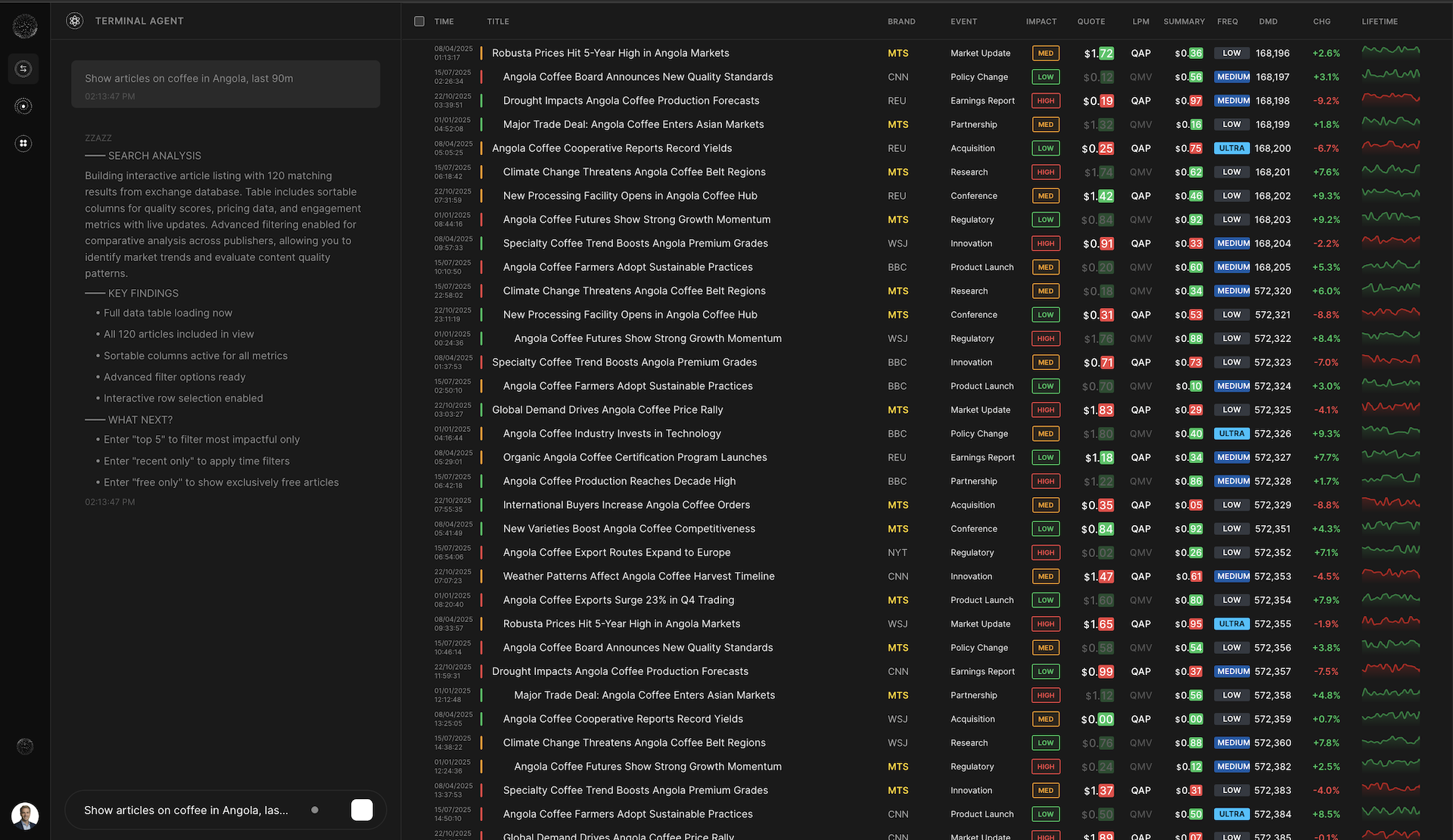
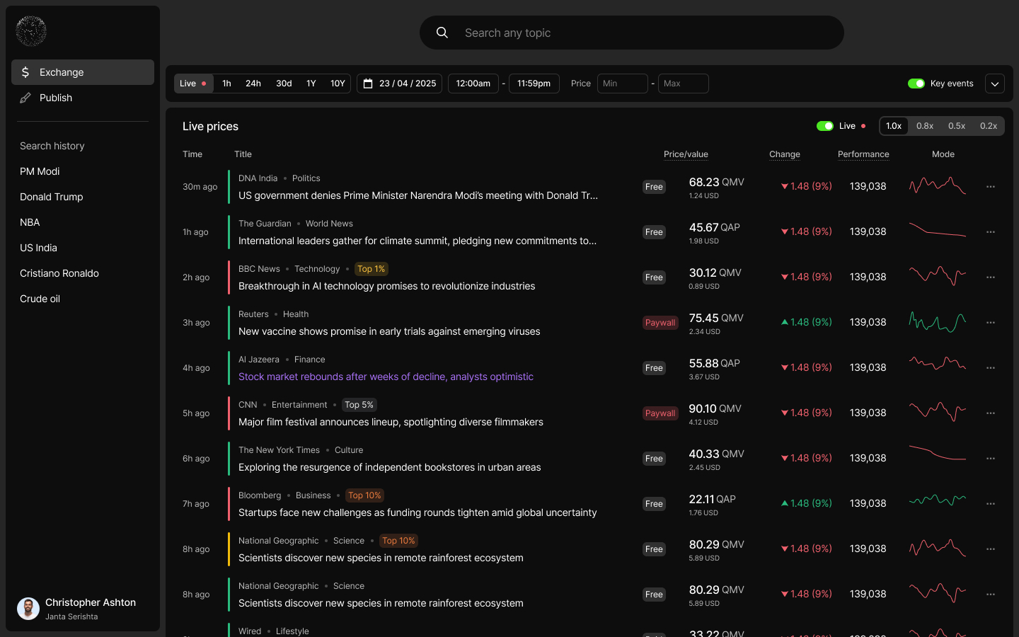
The screen that took most of the heat was Exchange.
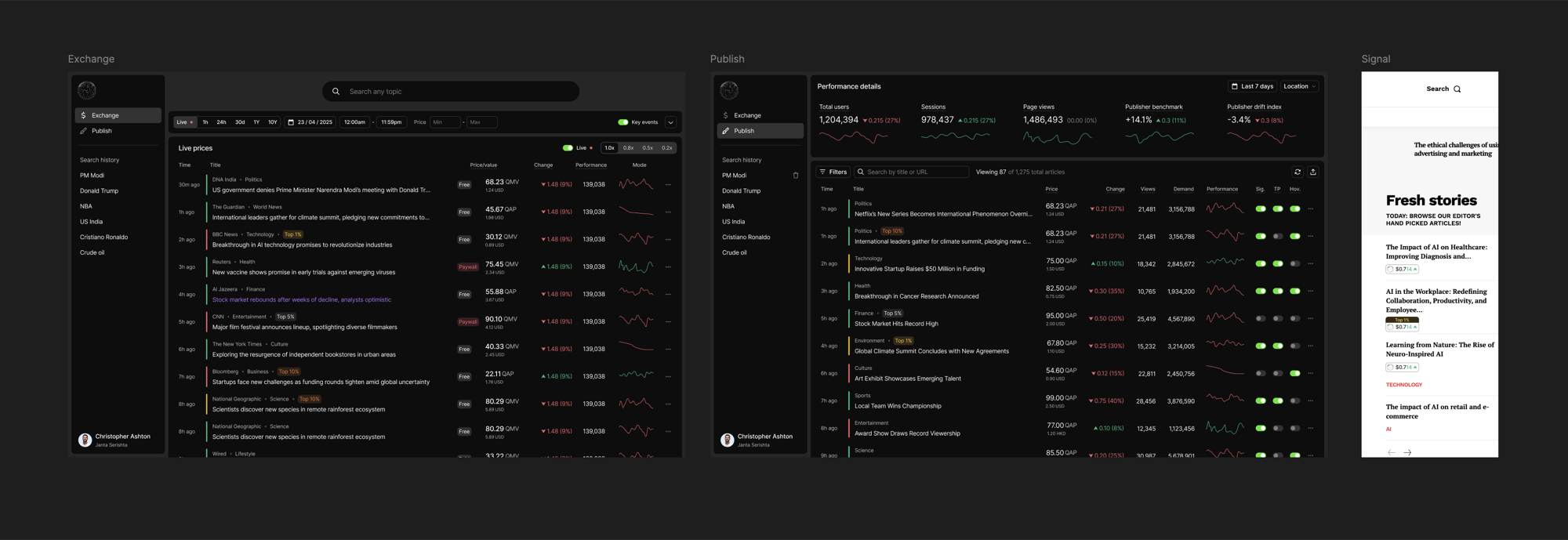
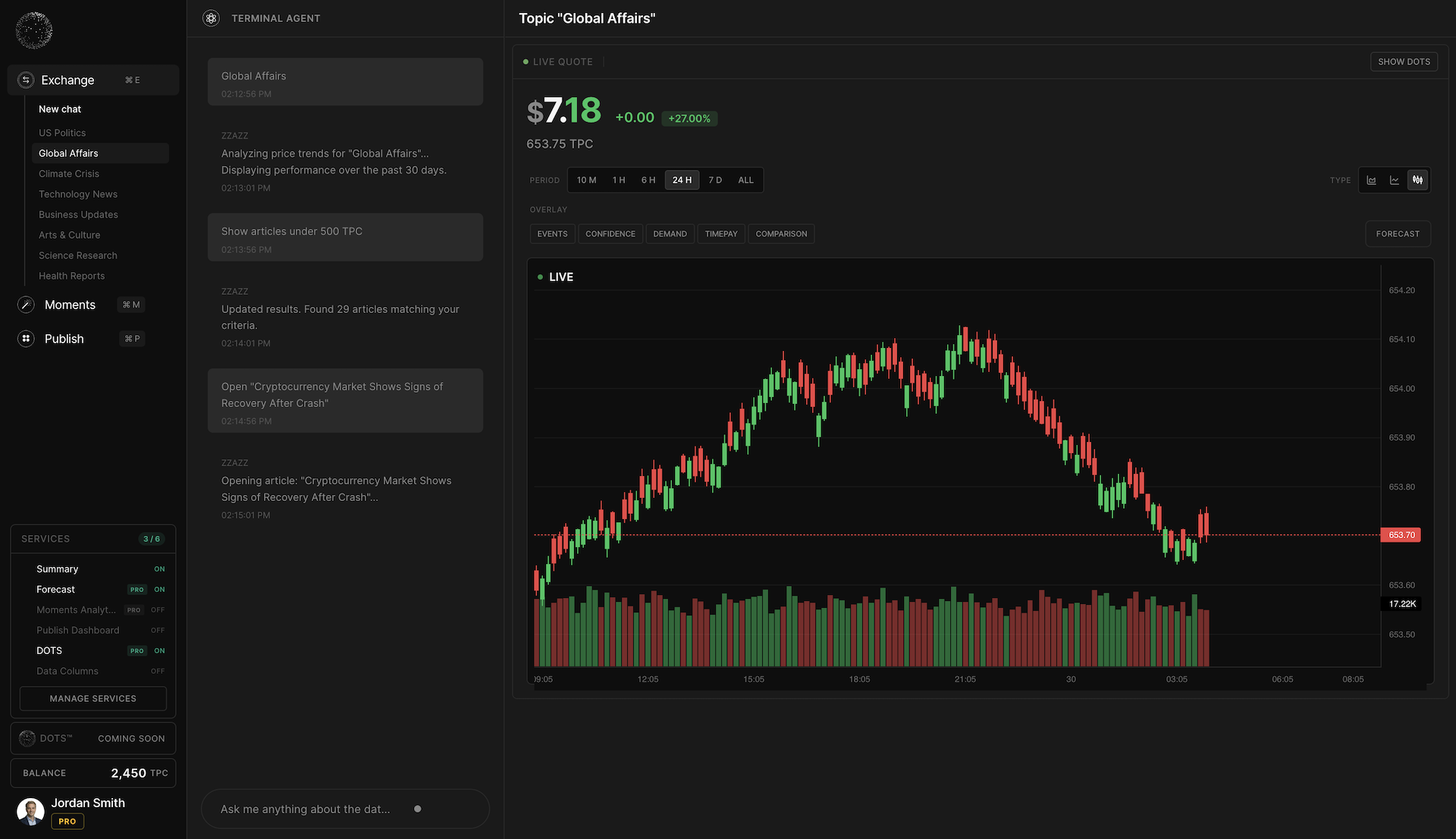
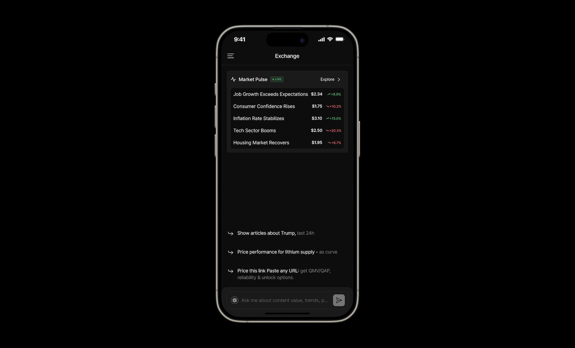
I redesigned Exchange around the question
Exchange was where the research observation could actually become an interaction model. It’s the vertical worth showing in detail — and the one product I now own end-to-end, from desktop to mobile.
The mental-model gap
The Exchange I inherited was a marketplace listing. Tables of content, price movements, performance data, trust factors — all visible at once, all filterable. The users it was built for were content traders. The users actually showing up were researchers, writers, and editors. Two different mental models hitting the same screen.
In testing, the dominant pattern was clear: people stated their need in natural language. “I want to see how cricket coverage from sports publishers compares this week.” They didn’t construct it filter-by-filter. They asked the question.
Query-led IA — the question is the interface
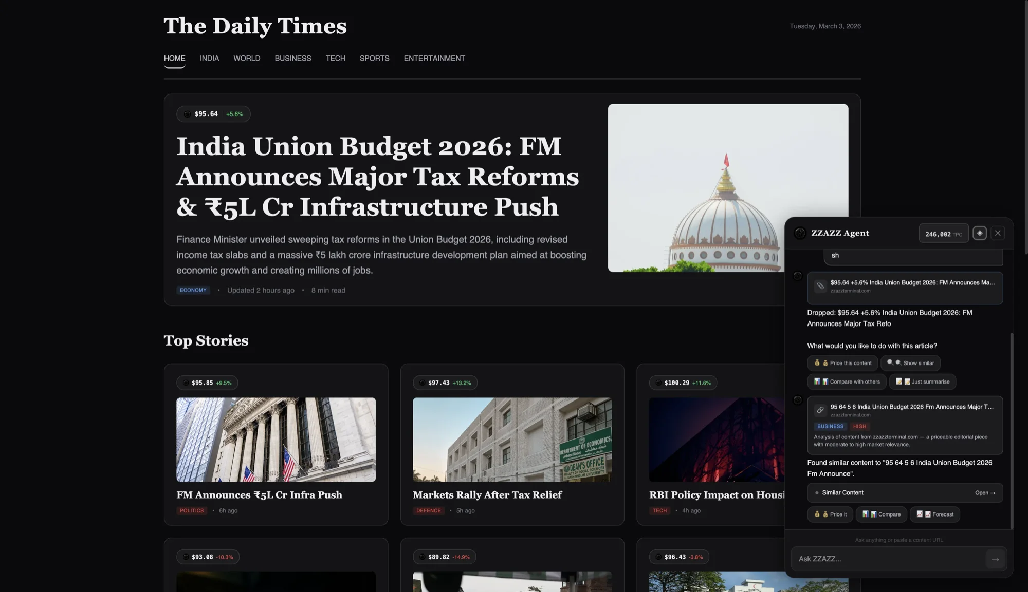
I redesigned Exchange around a single primitive: the question. Users type the question; the system generates the artifact. The artifacts aren’t the interface. They’re the output. The conversational input is the interface.
The IA inversion was a harder decision than it looked. Filter chrome was familiar — a real risk that researchers would expect it and feel lost without it. Testing the new model showed the opposite: removing the filters reduced time-to-first-result and removed the “did I ask correctly?” anxiety entirely. Once the query bar was the only entry point, users stopped trying to construct queries and started asking them.
Results as artifacts, not navigation
The same query produces different artifacts depending on what the question implies — a comparison query gets a table, a trend query gets a chart, an exploration query gets a summary, a “find me content like X” query gets a ranked list. Users don’t pick the visualisation. The system picks it.
This became the central design rule the rest of Exchange flowed from. When the underlying system can generate any visualisation, the design job isn’t picking the right one — it’s encoding the rules for which visualisation answers which kind of question. We mapped four artifact types to four query intents, with fallbacks for ambiguous cases and refinement state on every artifact.
The query persists. Users refine the same question instead of starting over. “Now compare last month.” “Show me only the top three.” The conversation builds; the artifacts update in place.
Mobile — where the IA was actually tested
We didn’t design Exchange mobile-first. We didn’t have to. Once the query bar was the only entry point and the artifact was the only output, the design ported to a phone screen with almost zero rework — no filter chrome to compress, no sidebar to collapse, no table chrome to make horizontally scrollable. The query bar became the keyboard’s accessory; the generated artifact became the body of the screen.
That was the real test of whether the IA was right. Filter-led desktop interfaces are notoriously hard to ship on mobile — the chrome doesn’t compress, and the alternatives (drawer filters, modal sheets) move users away from the content. A query-led interface skips the problem entirely. Mobile users were already thinking in questions; we just stopped getting in their way.
What this taught me about AI-native UX
The interface gets simpler when the system gets more opinionated. Exchange is the project that taught me that — it’s now the lens I use on every AI-native surface.
Then I realised Exchange alone wouldn’t matter
The Exchange redesign tested clean. Researchers got their answers in a fraction of the time. But sitting in a product review a few weeks later, watching us debate which POC to ship next, I caught the deeper problem: even a perfect Exchange wouldn’t move the needle on its own.
Pricing content is a market design problem, not a UX problem. If the price on each row was real, three new questions appeared immediately — and none of them were being answered:
- Users had no behavioural pattern for “pay per read” at scale.
- Publishers had no new monetisation surfaces, ad logic, or ownership rules to earn from content that didn’t fit subscription.
- No new platform pulls users away from existing reading habits — the system has to meet them where they already are.
I shifted the conversation in internal reviews from “which POC do we ship first?” to “what ecosystem makes any single POC believable?” The work I did from that point on wasn’t in my original scope. Nobody told me to do it. Nobody said no when I started.
Three problems, seven verticals
Testing surfaced three problem categories. Only one was a UX problem — and Exchange had answered it. The other two stayed open, and that’s where the rest of the ecosystem had to live.
Users wanted to ask 'how is Modi vs Trump content performing from top publishers in my region?' — not reverse-engineer a filter combination. Exchange's query-led model closed this gap.
Price worked as a quality signal — until users had to pay it. The same number that built trust as a label became friction at checkout. A behaviour-bridge problem, not a UX one.
Three POCs running in isolation didn't prove the thesis. Users couldn't see why pricing one article would change anything about how they consume content. A strategy problem, not a UX one.
Each vertical exists because removing it breaks adoption, monetisation, or trust. Together they form the system below — Exchange, Publish, Moments, TimePay, Ad Exchange, DOTS Protocol, and Signal Pill.

Where users already are — Widget, Plugin, Terminal
A new platform pulls nobody. So the ecosystem had to enter the user’s existing behaviour, not ask them to leave it. Three form factors, in parallel — two that live inside what users already do, and one that absorbs the entire platform under a single interaction model.
Widget and Plugin — meet readers inside the reading
Widgets sit on publisher sites where readers already are. Plugins ride along with the browser tabs they’re already opening. Neither asks the user to adopt a new destination, sign up, or learn a new vocabulary. Both succeed by being adjacent to an existing habit, not by replacing it — the Widget surfaces pricing intelligence inside the page in front of the reader; the Plugin carries that capability across any URL the next time they hit a paywall.
Terminal — and the new vision for Exchange
This is where one insight from testing kept landing: why do people need to learn new terms? The seven verticals — Exchange, Publish, Moments, TimePay, Ad Exchange, DOTS, Signal Pill — each had a name that mapped to a service. But users didn’t want to memorise the map. They wanted to ask the question and get the answer.
So Terminal stopped being “the standalone chat interface for power users.” It became the front door to the whole platform, where every vertical surfaces through the same conversational input. Ask about pricing for an article — Exchange answers. Ask how a piece is performing — Publish. Ask about earnings for a creator — Moments. The vertical names stay, for publishers and operators. Readers never have to learn them.
That same insight is why Exchange’s redesign mattered beyond Exchange. The query-led model wasn’t just a better marketplace — it was the prototype for how every vertical would be reached. One input. Many artifacts. Zero terminology to learn.
| Form Factor | How it enters | What it surfaces |
|---|---|---|
| Widget | Embedded on publisher sites — inside reading users already do | Pricing intelligence on the article in front of the reader |
| Plugin | Browser extension — rides along with existing tabs | Cross-web pricing on any URL when a paywall appears |
| Terminal | Chat-first front door | The full platform’s services through one input — no vertical names to learn |

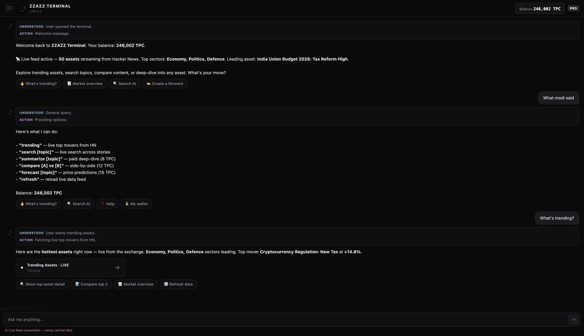
The graduation path is still Widget → Plugin → Terminal — but the destination changed. Terminal isn’t where power users go to use more; it’s where any user goes to interact with the platform without learning its vocabulary.
Building the team that built the system
By month four, the architecture was bigger than I could execute alone. The seven-vertical scope, three form factors, and active user testing made this a five-designer problem at minimum — and we had two.
I didn’t ask for headcount. I wrote the briefs. Each new designer was hired against an architecture document I’d already written, with their vertical’s scope, dependencies, and design principles defined upfront. The team grew from one to four, each designer owning a vertical (or two), with the system coherence holding because the rules existed before the people did.
The test of an architecture is whether someone else can build inside it without you. Four designers shipping against the same logic — without me reviewing every screen — is the proof.
| Design Team Size | Before: 1 After: 4 |
| Verticals Owned by Team | 7 |
| Architecture Conflicts at Handoff | 0 |
| POCs to Coherent Ecosystem | 8 mo |
Signals — what told us the bet was working
Surveys can be coached. Behaviour can’t. The strongest signals were the ones we never asked for — five things that kept happening on their own, each one validating a different layer of the architecture.
Publishers used pricing as an internal decision tool before exposing it to readers. The internal-first adoption path was something I’d designed for explicitly — and it became the path most publishers actually took.
Price worked as a quality signal when informational. Higher-priced content was perceived as more trustworthy. Confirmed in user testing, repeatedly.
Payment triggered sharp psychological friction the moment it entered. Same price, different reaction. This validated TimePay’s three-path model — cash, credits, sponsored attention — as critical, not optional.
The conversational direction resonated with investors. The Terminal’s chat-first architecture was the surface that landed strongest in pitches.
The team scaled. Growing from 1 to 4 designers shipping coherent work validated that the architecture could hold multiple owners.
Key Learning
The job description is the floor, not the ceiling. I was hired as a Product Designer. The interface gap I was supposed to close was real — but it was the smallest of the gaps actually in front of the company. The work that mattered wasn’t doing the assigned job better; it was seeing which assigned job was the wrong one, and acting on the right one. Two of the three problems I found weren’t design problems. The design problem worth solving was inventing the architecture inside which the other two could even be addressed.