Building one design system across 5 product teams
Five product teams at Clear were each shipping their own filter panels, dropdowns, breadcrumbs, tags, and cards — with no central team owning the canonical ones. The result: 760 button variants in Figma and every pattern duplicated across teams. I built Mint V8 from scratch — tokens, PCS Logic, and the central design system team that finally owned the library. 100% adoption across all five teams in six weeks.
No one owned the components — so every team built their own
The brief looked like a Figma cleanup. Within a week, I realised the work was upstream.
Clear’s product org sits in two suites — Finance Cloud (Platform, TDS, GST, E-Invoicing) and Supply Chain — five teams in total, each with its own designers and engineers. With no central team owning components, every team had built and was now maintaining its own version of the same patterns: filter panels, sort, action dropdowns, breadcrumbs, CTA hierarchies, tags, cards.
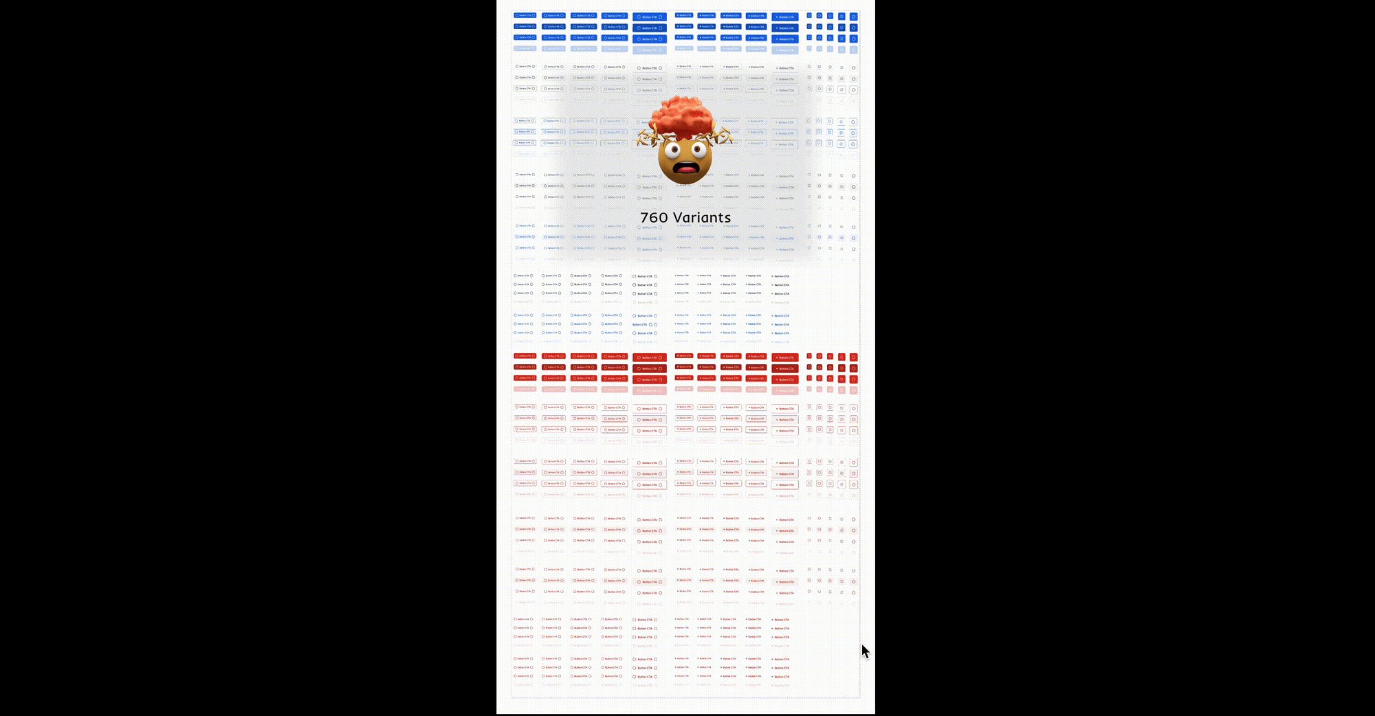
The numbers were the sum across teams, not one team’s chaos. 760 button variants in Figma. Multiple filter panels. Different action dropdowns. Tags styled differently in every flow. Each team had solved the same problem in isolation — often unaware another team had already shipped a version of it.
“Four teams shipped four action dropdowns. They all work, they’re all slightly different, and now we maintain all of them.” — Priya, Senior Product Designer · Clear
That was the brief. A design system isn’t a Figma file or a component library — it’s a team that owns the canonical components, and a discipline that stops the duplication from coming back. We needed to build all three: the team, the library, and the rule.
Four teams, four versions of the same action menu — different triggers, different item layouts, different menu styles, all maintained in parallel.
Three symptoms of one problem
A library audit across all five teams surfaced numbers that sounded impossible until I saw them. 760 button variants. 624 badges. 113 inputs. Years of every team solving the same problems in isolation, with no one consolidating.
Button variants across teams' Figma files. Filter panels, sort, action dropdowns, breadcrumbs, tags, and cards each existed in multiple competing versions — every team maintaining their own.
Central team owning the canonical components. Each crew solved the same problem in their own file, often unaware another team had already shipped a version of it.
Each new theme required forking every component. Finance Cloud and Supply Chain needed different brand colours — but the system had no shared way to express variation.
The fix needed two pillars and a team:
- Tokens — a shared vocabulary every team refers to, and the foundation for one canonical library.
- PCS Logic — a designer-side pattern for composing new components from a shared shell, instead of inventing new ones.
- A central team to own and evolve both, on behalf of every product crew.
Tokens before components — even at the cost of shipping faster
The team wanted quick wins — ship a few clean components now, fix the foundation later. I pushed back. Without tokens, every new component would inherit the same problems: hardcoded values, no theming path, no naming discipline that crossed team boundaries. Three weeks of foundation work would pay back ten times in six months.
The trade-off was real, but every component built on tokens would be theme-ready by default — the only way Supply Chain could ship in purple without forking the entire library Finance Cloud was now consuming.
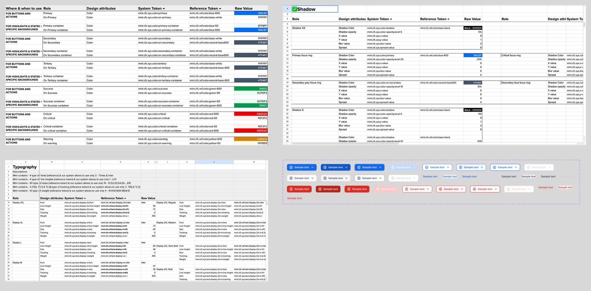
I structured tokens in four categories: typography, spacing, colour, and elevation. Each got semantic names tied to usage, not appearance — primary not blue-600, body-m not 16px. The naming convention was the first decision that crossed team boundaries.
That made tokens the shared vocabulary. Designers authored them as Figma variables. Engineers consumed them as CSS custom properties and JSON. For the first time, every product crew referred to the same name when they meant the same thing.
The Mint V8 token sheet — every component property mapped to a system token, a reference token, and a raw value across both themes.
| Role | System Token | Reference Token | Raw Value |
|---|---|---|---|
| Primary | mint.cfc.sys.color.primary | mint.cfc.ref.color.blue-600 | #156CEF |
| On Primary | mint.cfc.sys.color.on-primary | mint.cfc.ref.color.base-white | #FFFFFF |
| Primary Container | mint.cfc.sys.color.primary-container | mint.cfc.ref.color.blue-50 | #EFF8FF |
Two themes, zero component duplication
The token-first decision paid off the moment we tried theming. Finance Cloud needed blue. Supply Chain needed purple. In the old setup, that would have meant rebuilding the library twice. With tokens, it meant changing one mapping.
Components didn’t know which theme they were in. They consumed mint.sys.color.primary and the theme decided what that meant. The proof: Supply Chain shipped without forking a single component.
One toggle, two brands. Components consume mint.sys.color.primary; the theme decides what that resolves to.
Atoms, molecules, organisms — and the missing rule
With tokens in place, the next pillar was the design-side one. Every team had a shared vocabulary; designers needed a discipline to stop the duplication from coming back the next time a new component was needed.
We structured the component layer using atomic design:
- Atoms — tokens, icons, typography
- Molecules — buttons, inputs, dropdowns
- Organisms — forms, modals, tables
Tokens become atoms, atoms become molecules, molecules become organisms — the layered structure that made the library composable.
We also added dynamic icon weights — the same icon in body and label weights — so visual hierarchy held across component sizes.
The same icon, swapped between body and label weights — visual rhythm holds whether it sits inside a paragraph or a metadata chip.
It worked for everything except the variant problem. Buttons still had 760 variants. Atomic decomposition explained how components were composed — but not why teams kept inventing new ones for nearly identical use cases. The library kept growing because the rule for not growing it didn’t exist yet.
Then we noticed something on a whiteboard
It happened in a working session, not a planned exercise. We were sketching button variants — primary, secondary, with-icon, with-counter, danger, disabled — and someone drew arrows showing what was actually changing across them. The structure was the same every time. Something on the left, something in the middle, something on the right.
Prefix. Content. Suffix.
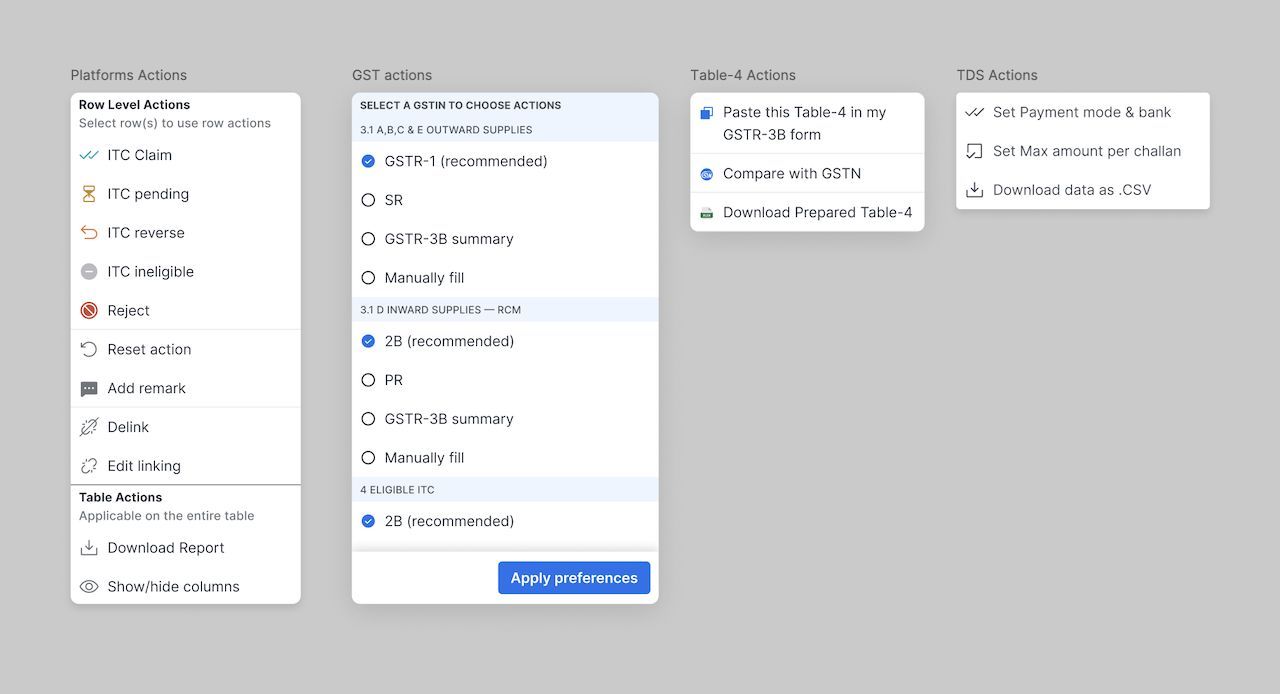
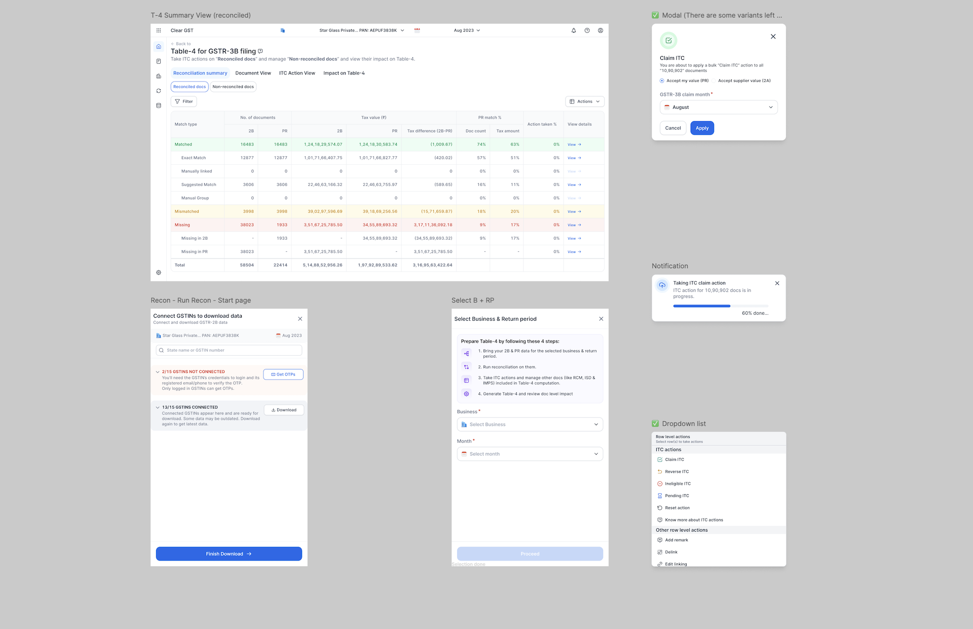
That observation became PCS Logic. Every component was a shell with three slots, constrained per component type — a button’s prefix is an icon, never text; a badge’s content is text or counter, never both. Within those guardrails, every real-world variant could be composed instead of invented.
PCS lives entirely in Figma. It’s not a runtime pattern — engineers don’t compose by P + C + S, they consume the finished component. PCS is what designers use internally, across teams, to keep the library small. When GST needs a filter panel with a counter, or TDS needs a tag with a status dot, or E-Invoicing needs a card with a CTA — they compose from the shell. A discipline for designers, not an API for engineers.
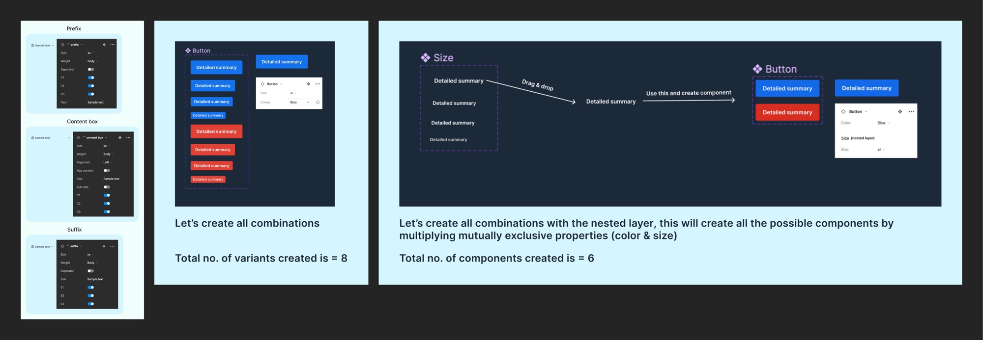
Eight Prefix–Content–Suffix combinations replace what used to be 760 hand-built button variants.
“The PCS logic literally saved us weeks in component rebuilding.” — Product Designer · Mint V8 team
Slot, swap, ship. Designers compose a button from PCS slots instead of inventing a new variant.
Mandates create resistance — adoption is a design problem
With the foundation and components ready, the Design Manager wanted immediate system-wide deprecation. Force everyone to migrate. Hit 100% by quarter-end.
I pushed back. Mandates create resistance — especially for teams who’d spent months building their own filter panel and now were being told to throw it out. Adoption isn’t an org problem. It’s a design problem. Make the central library easier than maintaining your own, and every team will choose it themselves.
So I shipped four adoption mechanisms instead of one mandate:
- Weekly PCS workshops — 45-minute sessions where designers across teams built components together
- Shared Figma playground — interactive PCS components for live experimentation
- Token sync pipeline — design tokens exported to JSON for engineers to consume directly
- Gradual deprecation — seven to eight screens migrated per sprint, never all at once
By week four, designers from Platform, GST, and Supply Chain were running the workshops themselves. Engineers were proposing token additions. Migration was happening without anyone asking.
By week 6, every team had chosen it themselves
The adoption curve didn’t look like the manager’s mandate would have produced. It looked like a flywheel. Sprint by sprint, more screens migrated. Engineers stopped maintaining team-specific implementations — consuming from the central library was now faster. Designers stopped inventing one-off variants — composing PCS slots was now easier.
By week six, every active screen across all five product teams was on Mint V8. 100% adoption — not because anyone was forced to migrate, but because the central library had become the path of least resistance.
“I was skeptical. Once I built with PCS, I couldn’t go back.” — Vikram, Senior Product Designer
“Naming conventions and spacing rules made it so much easier to code with confidence.” — Frontend Engineer · Clear
Results & Impact
The audit, six months later — across all five product teams.
| Challenge | Solution | Outcome |
|---|---|---|
| Fragmented design language | Token-based atomic architecture | Unified across all five product teams |
| No central component owner | Mint V8 design system team | One canonical library, owned and evolved |
| Impossible theming | Token values mapped per theme | Brand customisation without forking |
| 760+ duplicate variants | PCS Logic (Prefix, Content, Suffix) | 80% variant reduction in the library |
| Every team maintaining their own | Shared library + cross-team workshops | 70% less rework across the org |
| Inconsistent icon weight | Dynamic icons in contextual weights | Improved visual rhythm |
Key Learning
A design system isn’t a Figma file. It’s a team.
Tokens were the bridge — every product crew needed the same names for the same things, or the duplication keeps coming back.
PCS Logic was the discipline — a designer-side rule for composing new components from a shared shell, instead of inventing new ones.
Neither pillar matters without a central team that owns and evolves both.
Adoption isn’t an org problem. It’s a design problem. Make the central library easier than maintaining your own — every team will choose it themselves.